DUCA
DUCA
Creative Direction
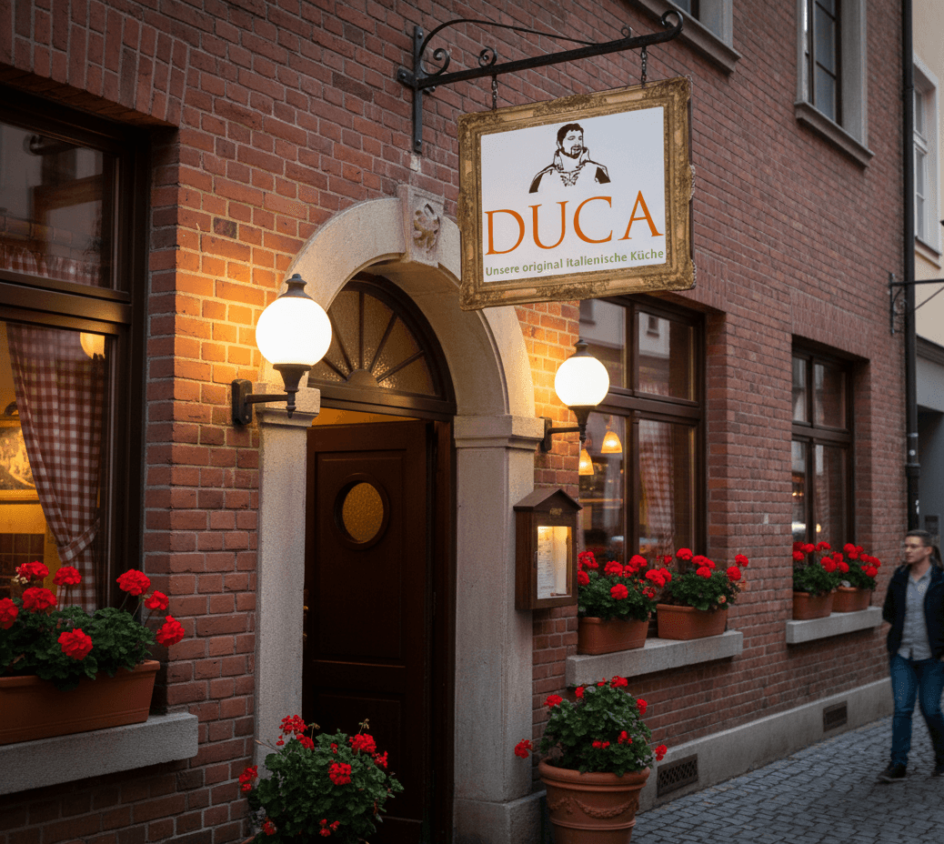
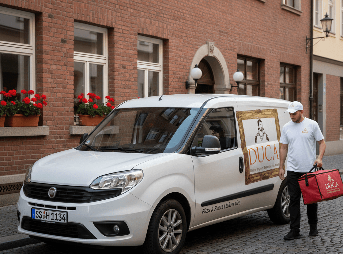
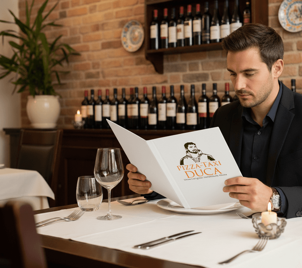
CASE STUDY: Most pizza places look like pizza places. Same fonts, same colours, same stock photo of a wood-fired oven. Duca needed to be something else. Duca is a pizzeria in Radolfzell run by Antonio, and the brief started with the name. Duca means duke in Italian, so the visual identity leans into that: Antonio's own face as the logo, rendered in a classic illustrative style that sits somewhere between a noble portrait and something you'd want on a wine label. Familiar and a little bit grand at the same time. Before any design decisions, I ran interviews and questionnaires with existing customers. The finding that came back consistently: people wanted to know who was making their food. Not just that it was good, but whose hands it came from. That became the backbone of the project. The website and menu were designed as a visit to Antonio's house. Each section opens like a room: family photos on the walls, framed images of traditional dishes, stories that connect the food to his family's history. Green and brown run through the colour palette, colours that feel grown rather than chosen off a brand chart. The identity covered everything: logo and visual concept, corporate identity, menu design, website, staff uniforms, delivery vehicle graphics, and packaging for pizza and pasta. When every touchpoint is part of the same story, the brand stops being a logo. It becomes somewhere people feel they already know.